
Back to work
Product
2024
Case study
Appointment no-shows
On-time consultations
Doctor satisfaction rating
Designer’s note
Ata ul Mohsin, Lead Designer
What we did
Product design, Healthcare UX research, UI design, Scheduling and forms UX, Prototyping, Design system, Developer handoff
Client
Eclinic
Year
2024
Timeline
14 weeks
View on Behance ↗
01
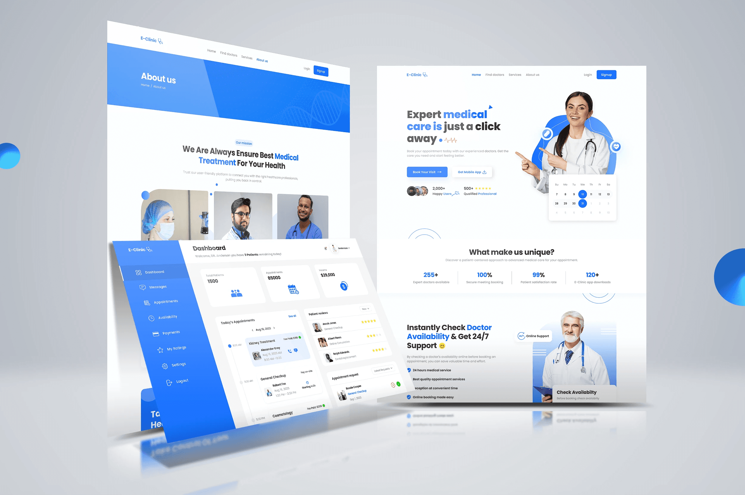
Eclinic is a doctor and patient management product. We built it around the few actions clinic staff repeat all day. Appointments, records, and forms are quick to reach and easy to scan.
Client
Eclinic
Industry
Healthcare
Platform
Web app
Services
Product design, Healthcare UX research, UI design, Scheduling and forms UX, Prototyping, Design system, Developer handoff
Tools
Figma, FigJam, Zeplin, Maze, Notion
Timeline
14 weeks
02
Clinic staff work through repetitive tasks throughout the day, from checking schedules and finding patient records to completing forms and managing appointments. When these actions are spread across cluttered tables, lengthy forms, and inconsistent screens, small usability problems accumulate into unnecessary friction. Searching for a record takes longer when the information is difficult to locate. Completing a form becomes more demanding when every field is presented at once, and navigating between separate sections interrupts the flow of everyday work. Eclinic needed a product experience built around the actions doctors and clinic staff repeat most often. The challenge was to make schedules, patient information, appointments, and records accessible through a clearer and more consistent interface.
01
Two stressed audiences
Patients are anxious; doctors are rushed. The product had to lower the temperature for both.
02
Scheduling complexity
Rooms, availability and follow-ups created edge cases that broke simple calendars.
03
Clinical accuracy, friendly tone
The interface needed warmth without ever feeling imprecise.
03
We designed two calm paths that meet in the middle: patients book, prepare and follow up; doctors see a day that is already organised. Appointment states share one visual language, and the consultation screen keeps notes, history and prescriptions within one view.
04
We designed the Eclinic product for both doctors and patients, establishing a more focused structure for everyday healthcare interactions. The dashboard opens with the day's schedule, giving staff an immediate view of their appointments and helping prioritise the tasks ahead. A shared search field provides access to patients and records, reducing the need to navigate through multiple sections to locate information. Longer forms are divided into shorter, saveable steps, making them easier to complete and allowing users to progress through the experience in manageable stages. Appointments and patient records use consistent layouts and readable information hierarchies. A reusable design system brings the screens together, while the developer-ready Figma handoff documents the components and interface states. The result is a calmer healthcare web application designed around everyday clinical workflows, making essential information easier to access and common tasks easier to follow.
Where it landed
Client review
Olivia Bennett
Clinic Operations Manager
